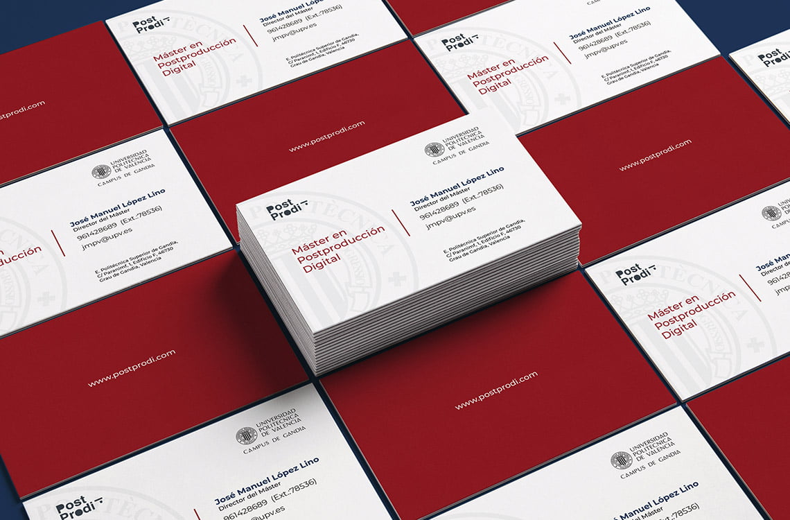
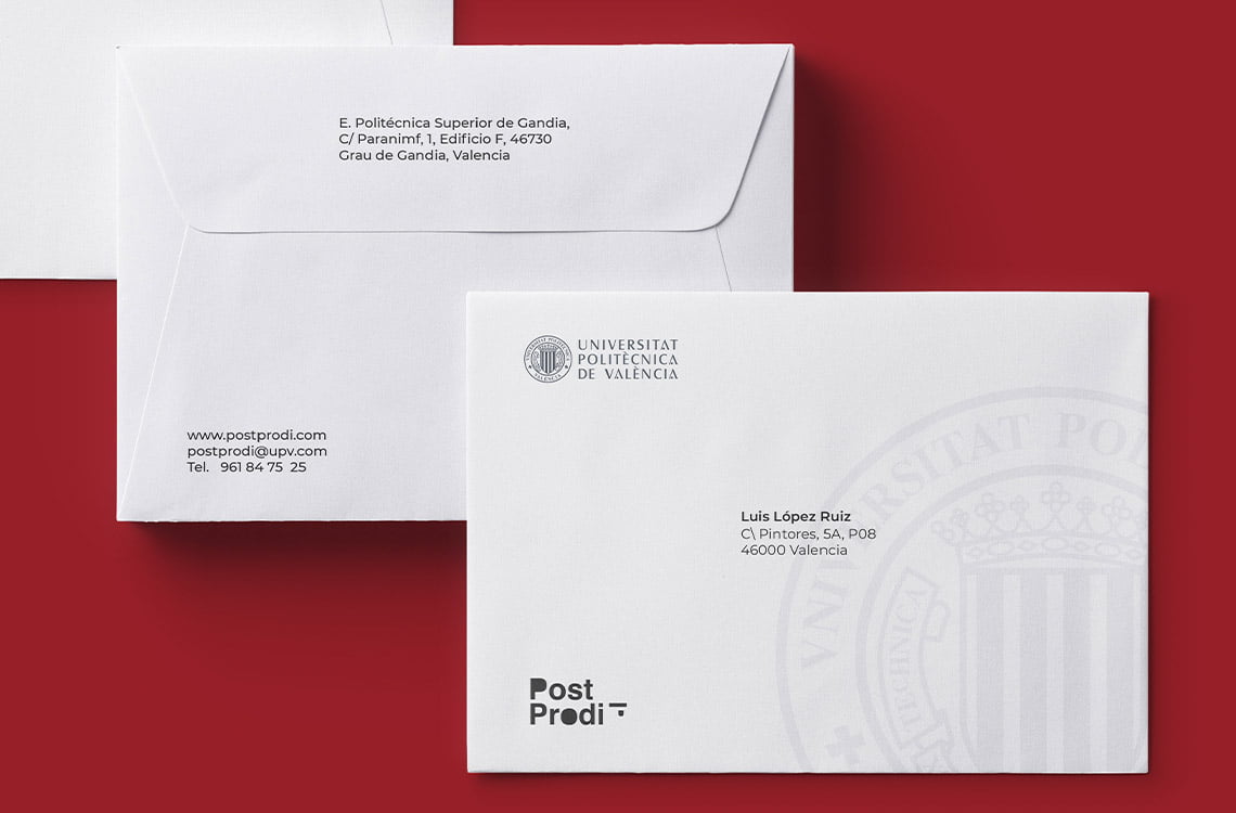
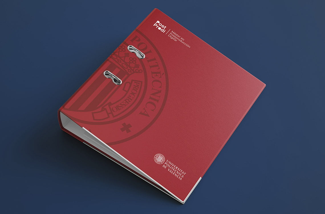
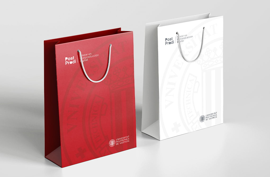
The Master in Digital Postproduction at the Polytechnic University of Valencia, has the need to create a visual identity to communicate and connect with students, the brand name of the master is Post Prodi, which means Digital Postproduction, and this brand must be capable to be linked to the target audience, which are students who have finished a university degree.The Master in Digital Postproduction is responsible for teaching the final phase of the process of making an audiovisual product, covering the narration, editing and composition of audio and video. To carry out this project, we have thought about the typeface, corporate colors, print media and online media.

The legibility of this typeface is something very remarkable, since even while in motion you can read and understand what you want to transmit, for this reason traffic signs, car manufacturers, airline company logos use this type of font. At the same time, this type of font has a great balance between the urban and the academic, for that reason, well-known brands around the world use the font to convey their personality and be able to become known among their target audience.Example: The New York Subway, American Airlines, Staples, Toyota, American Apparel, Panasonic.
AaBbCcDd1234#€$@
A B C D E F G H I J K L M N O
a b c d e f g h i j k l m n o
0 1 2 3 4 5 6 7 8 9
¡ # € $%@*/&


CORAL RED
PANTONE 53 - 16C
RGB/ 175 - 25 - 34
#AF1922
NAVY BLUE
PANTONE 540 C
RGB/ 0 - 48 - 87
#003057
BLACK
RGB 0 0 0
#000000
